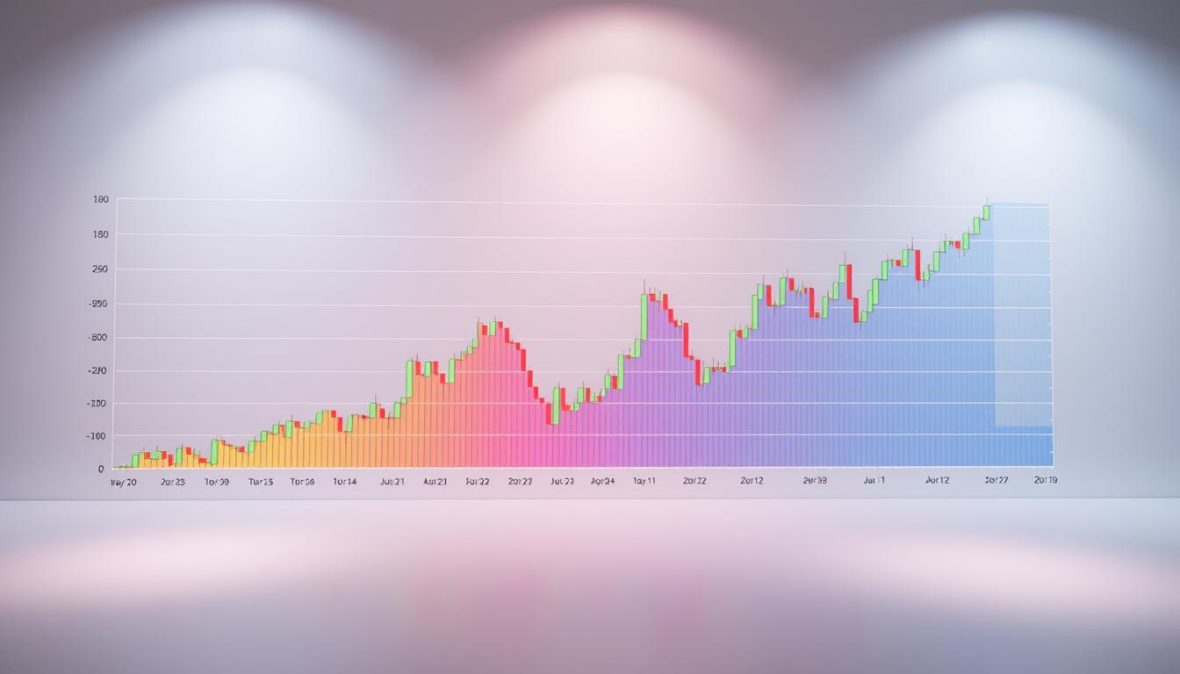
Bitcoin Rainbow Chart: Historical Insights and Insights
Cryptocurrency has changed finance, with Bitcoin leading the way. Now, 6.8% of people worldwide own crypto, up 34% from 20231. The Bitcoin Rainbow Chart tracks historical price trends1.
Launched in 2014, this colorful chart gives investors a new view of Bitcoin’s price moves2. It groups price ranges into colored bands, showing market sentiment simply1. Investors use this tool to spot potential market cycles.
Bitcoin’s wild price ride has caught global attention. It recently topped $100,000 in value1. The chart’s log scale shows Bitcoin’s long-term growth2. It’s a key resource for all investors.
Key Takeaways
- Bitcoin ownership has grown significantly in recent years
- The Rainbow Chart provides a color-coded market sentiment analysis
- Cryptocurrency continues to attract global investor interest
- Price prediction tools offer insights into market trends
- Bitcoin demonstrates remarkable financial volatility
What is the Bitcoin Rainbow Chart?
The Bitcoin Rainbow Chart is a unique tool for understanding cryptocurrency price trends. It turns Bitcoin’s price history into a colorful spectrum. This helps investors navigate bull market cycles with better insight.
This chart is more than just a pretty graphic. It’s a logarithmic price chart that maps Bitcoin’s price movements. It uses a spectrum of colors to show various price zones.
Decoding the Color Spectrum
The chart uses different colors to signal market sentiments:
- Blue (Lowest Zone): Extreme fear and potential buying opportunities
- Green to Yellow: Accumulation and early growth stages
- Orange to Red: Peak market excitement and potential overvaluation
Key Components of the Chart
The Bitcoin Rainbow Chart has several critical elements:
- Logarithmic price scaling
- Color-coded market zones
- Historical price trend analysis
Investors use this chart to make informed decisions during different bull market cycles. It turns complex price data into an easy-to-understand format.
The Bitcoin Rainbow Chart turns abstract price movements into a clear, colorful narrative of market dynamics.
The chart’s intuitive design makes it popular among cryptocurrency enthusiasts. It bridges the gap between technical analysis and visual storytelling.
The rainbow metaphor makes complex market trends more accessible. Both new and experienced investors can benefit from this visual tool.
Historical Price Patterns of Bitcoin
Bitcoin’s price journey has been a wild rollercoaster, with dramatic swings captivating investors worldwide. Understanding these patterns is key for developing a strong long-term holding strategy2. The Bitcoin Rainbow Chart helps spot potential buy and sell signals across different market cycles3.
Tracing Bitcoin’s Price Evolution
Bitcoin’s price history reveals fascinating insights into market dynamics. It was first introduced as a financial tool in 2014, using a logarithmic scale2.
The chart’s color bands provide critical information about market valuation:
- Blue Bands: Indicate extreme undervaluation
- Green Bands: Suggest good accumulation opportunities
- Yellow Band: Represents a balanced price point
- Red Bands: Signal potential market overextension
Major Market Milestones
Key events, especially halving cycles, have greatly influenced Bitcoin’s price. These events happen every four years, cutting mining rewards and limiting new supply2.
Prices often hover around lower bands during halving events. They then gradually climb in the following years4.
| Market Phase | Price Characteristics | Investor Strategy |
|---|---|---|
| Blue/Light Blue | Highly Undervalued | Aggressive Accumulation |
| Green | Relatively Cheap | Long-Term Hodling |
| Yellow | Balanced Price | Hold Current Position |
| Red | Overvalued | Consider Profit-Taking |
Institutional interest has changed Bitcoin’s landscape. BlackRock’s investments of over $250 million in March 2025 show growing mainstream acceptance3.
Projections suggest Bitcoin could reach $500,000 in the current cycle4.
Bitcoin’s journey is a testament to its resilience and potential as a transformative financial asset.
Interpreting the Bitcoin Rainbow Chart
The Bitcoin Rainbow Chart offers a unique way to track price trends. It uses a colorful spectrum to reveal insights into market psychology. This visual approach helps us understand cryptocurrency price movements better.
The Rainbow Chart uses color-coded bands to show market sentiment. Each color represents a different feeling about the market. It also suggests potential investment strategies.
- Dark Red (Extreme Fear): Potential buying opportunity
- Red (Fear): Market bottoming out
- Orange (Caution): Early recovery signals
- Yellow (Neutral): Moderate market conditions
- Light Green (Optimism): Emerging bull market
- Green (Greed): Strong upward momentum
- Blue (Euphoria): Peak market excitement
- Violet (Maximum Bubble): Potential market top
Decoding Color Signals
Investors can use these color zones to make smart decisions. Dark red or red zones may signal good times to buy. Violet zones might warn that the market is overvalued5.
Price Prediction Strategies
The Rainbow Chart offers valuable insights into market cycles. However, it’s best to use it with other technical indicators. This combination can help traders make better-informed decisions5.
The chart’s logarithmic regression bands show Bitcoin’s price trajectory over time. This broader view can be helpful for long-term investors.
Remember: No single indicator can predict market movements with absolute certainty.
Graphical Representation of Bitcoin Trends
The bitcoin rainbow chart is a powerful visual tool for crypto risk management. It turns complex price movements into an easy-to-understand color spectrum. This helps investors decode Bitcoin’s historical and current trends.
The chart maps price trends across different color zones. Each color shows a specific market sentiment and potential investment strategy.
- Deep Blue (Despair Zone): Indicates extremely low prices and potential buying opportunities
- Green (Accumulation Zone): Signals potential recovery and strategic entry points
- Yellow (Excitement Zone): Suggests growing market enthusiasm
- Red (Euphoria Zone): Warns of potential market overvaluation
Decoding Price Movements
Investors can use the bitcoin rainbow chart as a key risk management tool. It helps traders make smarter decisions about market entry and exit points6.
| Color Zone | Price Range | Market Sentiment |
|---|---|---|
| Blue | Lowest Price Levels | Extreme Pessimism |
| Green | Growing Prices | Cautious Optimism |
| Yellow | Mid-Range Prices | Increasing Confidence |
| Red | Peak Prices | Market Euphoria |
Current Market Analysis
Knowing the current position on the bitcoin rainbow chart gives important insights. It shows potential market movements. Investors can create better strategies for handling cryptocurrency changes by using these charts.
Statistical Insights from Bitcoin’s Price Data
Cryptocurrency price prediction requires understanding digital asset valuation metrics. The Bitcoin Rainbow Chart is a powerful tool for analyzing market trends. It offers more than just colorful visuals for potential price movements.
Bitcoin’s recent market activity shows fascinating statistical insights. Significant whale movements have occurred in the cryptocurrency landscape7. Over 27,740 BTC (about $2.4 billion) left exchanges.
- Over 27,740 BTC (approximately $2.4 billion) were withdrawn from exchanges
- One notable whale increased their holdings by 2,400 BTC
- Bitcoin ETF inflows have continued for eight consecutive days
Key Statistical Metrics Explored
Digital asset valuation requires examining critical technical indicators. The 20-week Exponential Moving Average is $88,682, serving as crucial support7. Psychological resistance points emerge at key price levels:
| Price Level | Significance |
|---|---|
| $88,682 | 20-week EMA Support |
| $93,300 | Yearly Open Price Resistance |
| $95,000 – $100,000 | Potential Buying Interest Trigger |
Historical Performance Insights
The cryptocurrency market shows intriguing patterns. Crypto unlocks add market dynamics, with over $351 million scheduled this week8. Historical data suggests interest rate changes can impact Bitcoin prices significantly8.
Investors should watch these statistical insights closely. The Bitcoin Rainbow Chart offers a nuanced approach to cryptocurrency prediction. It combines technical analysis with market trends for valuable digital asset valuation perspectives.
How to Use the Bitcoin Rainbow Chart for Predictions
The Bitcoin Rainbow Chart is a powerful tool for crypto investors. It helps them understand market trends and spot investment chances2.
To use the Bitcoin Rainbow Chart effectively, investors should follow these key strategies:
- Identify the current color band representing Bitcoin’s price2
- Understand the significance of each color zone
- Align chart insights with your long-term hodling strategy
Understanding Color Zones for Investment Decisions
The Rainbow Chart uses color-coded bands to show bull market cycles. Blue and light blue zones suggest Bitcoin is undervalued, offering potential entry points2.
Green and light green bands indicate cheaper prices. These zones are ideal for starting a long-term hodling strategy2.
Tools for Enhanced Chart Analysis
Investors can use digital platforms to improve their Rainbow Chart analysis:
- Advanced charting software
- Real-time price tracking applications
- Cryptocurrency portfolio management platforms
The Rainbow Chart offers valuable insights, but it’s not a crystal ball. No single tool can predict market movements with total certainty2.
Successful crypto investing needs a broad approach. Combine multiple analytical tools and market research for best results.
Pro tip: Always cross-reference the Rainbow Chart with additional technical indicators and market trends to make well-informed investment decisions.
Mastering the Bitcoin Rainbow Chart helps investors navigate the crypto market more strategically9. It’s a valuable tool in any investor’s toolkit.
Frequently Asked Questions about the Bitcoin Rainbow Chart
The Bitcoin Rainbow Chart can be tricky to understand. This section clears up common questions. It offers useful insights for traders looking to improve their market analysis skills.
Both new and experienced traders can benefit from this information. It helps make sense of this complex tool.
Common Misconceptions Clarified
Some think the Bitcoin Rainbow Chart can predict exact prices. It’s actually a visual tool for understanding market trends. It helps traders spot buy and sell signals more effectively10.
- Myth 1: The chart guarantees precise price predictions
- Myth 2: Rainbow colors represent absolute investment strategies
- Myth 3: The chart works identically for all cryptocurrencies
Practical Tips for New Users
Here are key strategies for using the Bitcoin Rainbow Chart:
- Combine the chart with other technical analysis tools
- Understand that colors represent general market sentiment
- Use the chart as a supplement, not a sole decision-making tool
- Regularly update your understanding of market trends
Smart crypto trading needs a careful approach. The Bitcoin Rainbow Chart gives valuable insights. But it’s important to stay flexible.
Keep learning about market changes. This will help you make better trading decisions11.
Tools and Resources for Bitcoin Analysis
Crypto trading success hinges on having the right tools. Effective platforms can turn guesswork into strategic decisions for crypto risk management and price prediction.
The right tools can supercharge your crypto trading strategy. Here’s a list of key platforms that work well with the Bitcoin Rainbow Chart.
Top Charting Platforms for Cryptocurrency Traders
- TradingView: Comprehensive charting with advanced technical analysis features
- CoinGecko: Free real-time cryptocurrency price tracking
- CryptoCompare: Detailed market data and portfolio management
Essential Trading Tools for Risk Management
- Crypto portfolio trackers
- Risk calculation software
- Automated trading bots
Smart traders know that price prediction isn’t just about gut feelings. These tools offer vital insights into market trends. They help investors make smarter choices based on data.
The key to successful crypto trading is not just predicting prices, but managing risks effectively.
Choose tools with accurate real-time data and user-friendly interfaces. Look for platforms that integrate well with other systems. They should offer both price prediction and risk management features.
Good analytical tools can boost your trading performance. They’ll help you navigate the ups and downs of the crypto market with more confidence.
Evidence Behind Price Predictions
The Bitcoin world is ever-changing, revealing new insights into market cycles and investing. It takes a sharp eye to grasp digital asset values and market trends.
Understanding these can help investors make smarter choices in the crypto world. The landscape offers fascinating clues about bull markets and investment plans.
New studies show intriguing patterns in Bitcoin’s market behavior. Big investors have changed how people see cryptocurrency. It’s now viewed as a serious investment, not just a risky bet3.
Experts think big investors could push Bitcoin’s price to new highs3. This shift in perception is reshaping the crypto market landscape.
Key Research Findings
- Bitcoin’s cap of 21 million coins makes it an appealing digital gold investment3
- The cryptocurrency doesn’t follow traditional asset trends, offering unique investment options3
- Active Bitcoin addresses have hit nearly 800,000, showing strong market involvement3
Expert Market Predictions
Digital asset experts have spotted key factors affecting Bitcoin’s price path:
| Prediction Factor | Potential Impact |
|---|---|
| Institutional Investment | Potential price surge to $150,0003 |
| Market Volatility | Stabilization through ETF inflows3 |
| Economic Downturns | Potential counter-cyclical performance3 |
Bitcoin price predictions are complex and challenging. No method is perfect for forecasting cryptocurrency values. However, grasping these insights can guide investors through the tricky crypto market.
The Evolution of Bitcoin Price Patterns
Bitcoin’s price evolution reveals complex market cycles and long-term holding strategies. The crypto landscape has changed, showing intricate patterns that guide investments2.
Bitcoin’s price patterns show resilience through various market cycles. The Rainbow Chart, from 2014, offers a logarithmic view of Bitcoin’s growth path2.
This tool helps investors understand key market trends. Blue bands show extreme undervaluation. Green bands indicate good times to buy.
- Blue bands indicate extreme undervaluation
- Green bands suggest optimal accumulation periods
- Yellow zones represent balanced market conditions
- Red bands signal potential market overheating
Historical Price Dynamics
Bitcoin’s past performance reveals fascinating insights. Halving events, every four years, greatly impact price movements2. These events often trigger big market shifts.
After halvings, prices gradually climb towards higher valuation bands3.
Comparative Market Analysis
Bitcoin’s price evolution is unique among cryptocurrencies. Big investors like BlackRock see its potential, investing over $250 million3. This shows Bitcoin moving from speculation to legitimate investment.
The future of Bitcoin lies in understanding its complex market cycles and maintaining a strategic long-term hodling approach.
Some analysts predict Bitcoin could reach $150,00012. These forecasts highlight the importance of thorough market cycle analysis. Smart investment strategies rely on understanding these cycles.
Community Insights and Discussions
The Bitcoin community offers unique views on the Rainbow Chart. It turns complex price analysis into a shared learning experience. Crypto fans have created special strategies for buy and sell signals using this tool exploring market trends.
Connecting with Bitcoin Enthusiasts Online
Digital platforms are key for managing crypto risk. Traders share real-time insights about Bitcoin price patterns on these spaces.
Reddit and Twitter groups offer deep talks beyond regular market analysis. These discussions help traders make informed decisions.
- Top crypto forums for Rainbow Chart discussions
- Key online communities tracking Bitcoin trends
- Platforms for sharing trading strategies
“The Rainbow Chart isn’t just a tool—it’s a conversation starter in the crypto world.”
Real-World Applications of Community Knowledge
Expert traders often use group insights to improve their signals. This shared wisdom helps people navigate the tricky crypto world13.
By talking with different people, investors can build stronger risk management plans12. Community knowledge turns personal experiences into shared learning chances.
This shared knowledge makes complex market analysis easier to understand and use. It helps both new and experienced traders make better choices.
Conclusion: The Future of Bitcoin According to the Rainbow Chart
The Bitcoin Rainbow Chart offers deep insights into cryptocurrency price prediction. It’s a powerful tool that has changed how investors view Bitcoin’s potential paths2. Since 2014, this chart has shown Bitcoin’s long-term growth using a unique logarithmic view2.
Using the Bitcoin Rainbow Chart requires smart thinking and careful interpretation. Its color bands, from blue to dark red, give important clues about market conditions2. Investors can use these colors to see if Bitcoin is undervalued, balanced, or possibly overpriced.
Bitcoin’s cyclical nature hints at future growth potential. Past patterns around halving events show consistent price increases2. While not perfect, the Rainbow Chart helps understand possible market moves.
Smart investors use this tool along with thorough research for better crypto investment choices9. As crypto markets change, being able to adapt is crucial. The Rainbow Chart isn’t magical, but it’s a advanced analysis tool.
By mixing technical insights with broader market knowledge, investors can navigate digital assets more confidently. This approach allows for a more strategic vision in the complex world of cryptocurrencies.