Crypto Chart Reading Guide for Beginners
Almost half of retail crypto traders prefer learning from charts over news. It’s surprising since headlines and buzz usually get all the attention.
I created this guide because I’ve spent countless nights analyzing candlestick patterns. I learned a lot from my wins and tough losses. My aim is to demystify chart reading for those who trade on platforms like Coinbase, Kraken, or Binance.US. It’s crucial, especially as big investors influence market trends.
Bitcoin’s recent activity was significantly affected by inflows into spot Bitcoin ETFs, CoinDesk reports. The debate between Glassnode and QCP highlights how quickly data can shift the market narrative. It’s also important to watch for regulatory changes. For example, Reuters reported on France’s AMF raising issues with MiCA licensing which shows how new rules can make the market more volatile.
This guide aims to teach beginners how to understand crypto charts. You’ll learn to analyze price movements, assess risks, and develop trading strategies. We’re starting with the basics like candlesticks and volume analysis. This will lead you from simple charts to making informed trading decisions.
Here’s a tip to get started: focus on candlesticks and volume first. These elements tell you more than any social media buzz ever could. Later, we’ll dive into advanced charts, data analysis tools, and resources for those interested in technical analyses in the U.S. market.
Key Takeaways
- For beginners, reading crypto charts begins with understanding candlesticks and volume.
- This guide emphasizes hands-on learning from real trading experiences.
- Market prices are often influenced by institutional activities and regulatory changes.
- Knowing how to read charts can help you manage risk and form solid trading plans during uncertain times.
- Future sections will offer more advanced tools and resources for in-depth analysis.
Understanding the Basics of Crypto Charts
I began viewing charts as a visual story. Prices are on the vertical side, time on the horizontal, capturing market movements. This basic idea is key in understanding crypto charts for trading.
What is a Crypto Chart?
A crypto chart summarizes price movements. It converts countless trades into understandable patterns. For Bitcoin and Ethereum, the charts differ due to their volatility and liquidity. Recently, CoinDesk reported Bitcoin at about $115,000 and Ether around $4,500, highlighting how top coins fluctuate more than smaller ones.
Types of Crypto Charts
Line charts mark the closing prices. They’re straightforward and quick to review for a broad perspective.
Bar charts depict open, high, low, close. They offer insight into the price range without being overwhelming.
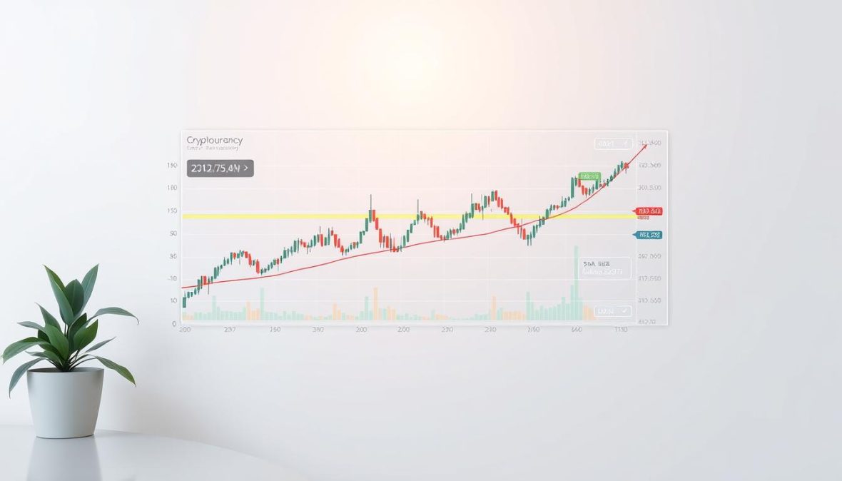
Candlestick charts give detailed information. A single candle shows open, close, high, and low prices. The timeframe you choose, from a minute to a month, depends on your goals. Short-term patterns might highlight during ETF inflows, according to Glassnode, even if the actual demand is lower.
Importance of Reading Charts
Charts assist in finding trends, planning entries, and setting stop-losses. They indicate momentum and sudden changes when news arrives. Regulatory news or ETF activity can cause quick price changes.
Adding volume to my analysis helped me understand movements better. It helps differentiate true breakouts from misleading ones. I followed insights from Glassnode and QCP, letting volume guide my trust in price spikes.
It’s crucial to remember, charts are just one part of the research. They add to your understanding of fundamentals and market mood. Mastering crypto chart reading and practice will sharpen your market decisions.
Key Terms and Concepts in Crypto Charts
When I look at a chart, I keep it simple. I focus on the shape of the price, the volume under it, and the news around it. This is a quick guide for beginners on reading crypto charts confidently.
Candlestick Charts Explained
Candlestick charts pack open, high, low, close data into one symbol. The main part is called the body. Slim lines sticking out are wicks. Color is key: green or white means up, red or black shows down.
Knowing pattern names is crucial. They tell us what traders might be thinking. A doji points to indecision. An engulfing pattern signals a shift. A hammer suggests a turnaround might be coming.
Once, a long wick fooled me until I checked the volume. It seemed like the sellers were winning. But the volume showed that buyers were actually taking charge. This insight totally changed my trading approach.
Support and Resistance Levels
Support represents a price range where buyers usually come back. Resistance is where sellers tend to show up. You can draw lines at these levels using past prices or by following the highs and lows over time.
It’s better to think of these as zones rather than thin lines. Prices tend to hover in an area, not just hit a single precise point.
Big news can smash through these zones before you know it. For instance, news about MiCA debates caused quick money movements that broke some altcoins’ support levels. In such times, tracking volume and money flow helps guess if the break will last.
Trading Volume and Market Cap
Volume helps verify price moves. If the price goes up with high volume, it’s a good sign. But, if there’s little volume, be wary.
The market cap is the price times the coins out there. It tells us the market’s size but not how easy it is to trade.
Sometimes, ETFs can raise the price even if not many are buying the actual coins. For example, while BTC ETF investments jumped one week, real buying didn’t match up. This is a cue to look closer at other trading signs before buying into the hype.
Here’s a tip: Always check price alongside volume. This shows if the trend has wide support or if it’s just a flash in the pan. It can prevent you from making moves on misleading signals.
The Components of a Candle
At first, crypto price charts seemed hard to understand with their candles. But as I learned, I saw each candle as a story of market intentions. Let me explain the parts of a candle and a useful rule for understanding crypto charts.
Open, Close, High, and Low Prices
The open is the starting price of the interval. The close is the ending price. High and low show the furthest points prices reached in the period. These four points reveal who had the upper hand, buyers or sellers.
If the candle closes higher than it opened, with short wicks, it indicates strong buying pressure. A long upper wick suggests buyers couldn’t maintain their high prices. And long lower wicks indicate buyers are interested when prices drop.
An example: around the $115k mark, traders looked closely at the candle bodies and wicks. They wanted to understand market sentiment while checking data on funding and futures. A rise in futures open interest on Glassnode confirmed a strong market intent.
Bullish vs. Bearish Candles
Bullish candles end higher than they start. Bearish candles finish lower than they opened. The color of the body makes it quicker to gauge momentum. A big bullish candle indicates strong buying momentum. A big bearish candle points to aggressive selling.
From my own experience, a large bullish candle with a lot of trading volume after a period of stability often signals a breakout. I always double-check my observations with longer-term charts and other data. This could be ETF flow reports or articles from CoinDesk.
Try this: look at three candles in a row and note if their sizes are changing. Decide if buyers or sellers are in control. Then, look at trading volume and recent news to confirm your analysis. Practicing this will improve your ability to read crypto charts, whether you’re a beginner or more experienced.
How to Analyze Trends in Crypto Charts
I like to keep trend analysis simple. This helps me teach beginners and also improves my own skills. By focusing on the essentials, we can better understand price movements without getting lost.
To understand the market, look for patterns of highs and lows. If you see higher highs and lows, buyers are leading. When lows and highs drop, sellers take over. I rely on 4‑hour and daily charts to avoid misleading data. This way, sudden news doesn’t confuse the real trend.
Identifying Uptrends and Downtrends
Uptrends are marked by increasing highs and lows. Downtrends do the opposite. Remember, a single event doesn’t define a trend. It’s better to check several movements over different times.
Here’s my approach: start with the daily chart, refine with 4‑hour charts, and finalize with the 1‑hour. This strategy helps beginners navigate crypto charts without getting misled.
Using Moving Averages
Moving averages help smooth out price changes. The simple moving average treats all data points equally. The exponential one prioritizes recent activity.
Popular settings include 50, 100, and 200 periods. Watch for crossovers; they hint at potential trend changes. A shorter MA crossing above a longer one suggests a possible upward move. The opposite suggests a downturn.
In my work, I use an MA ribbon to gauge price trends. For instance, when Bitcoin was around $115k, analysis of MAs and market activity helped predict future movements. Insights from QCP Capital on asset shifts were crucial.
Moving averages can guide us on market direction. They show trends and act like dynamic barriers. Mixing MAs with trading volume offers deeper insights into market sentiment.
A useful tip: combine MAs with volume and key economic indicators to verify trend strength. Glassnode’s observations on funding rates versus inflows teach us to be cautious. This precaution helps prevent misinterpretation of signals.
For beginners, here’s a checklist for chart analysis: confirm trend patterns, review MA ribbon and crossovers, check volume trends, and consider economic news. These steps can make learning chart analysis more systematic and less driven by emotion.
Tools for Reading Crypto Charts
I keep things simple for trading. My setup includes a clear platform, a handful of trusted indicators, and on-chain data. This guide shares the tools I use for analyzing crypto charts effectively and how to organize them.
Recommended Charting Platforms
TradingView is my main tool. It offers strong drawing tools, scripts from the community, and lots of indicators. I use CoinGecko and CoinMarketCap for quick looks at market trends.
For detailed exchange data, I turn to Coinbase Pro or Binance. I examine the order book closely before making trades. Glassnode helps with on-chain data. For broader market insights, I follow QCP Research and CoinDesk.
Useful Indicators and Analysis Tools
I mainly use RSI, MACD, and Bollinger Bands to gauge momentum and volatility. I also use Volume Profile and VWAP for day trading hints. Moving averages on the price pane and volume and RSI on a separate pane work well together.
For insight into exchange activities, I look at Glassnode and CryptoQuant. They show me things like inflows, outflows, and profitable supply data. ETF inflow charts and futures open interest give clues about market mood and traders’ positions.
Practical Setup and Workflow
I suggest a setup with two panes. Use the top for candles and a couple of moving averages. The bottom should display volume and RSI. Keep the Volume Profile or VWAP handy for day trades. Checking the exchange’s order book can change your trading strategies.
This combination of platforms and tools helps beginners. It makes learning how to read crypto charts easier. And it helps new traders get better at analyzing charts effectively.
- Price pane: candles, EMAs (20/50)
- Lower pane: volume, RSI
- Side tools: order-book depth, Volume Profile, VWAP
- On-chain: Glassnode, CryptoQuant
- News/flows: QCP Research notes, CoinDesk summaries
The Role of Technical Analysis in Crypto Trading
I started using technical analysis as a tool to gauge probabilities, not as a crystal ball. It helps me understand market behavior, guiding me on when to enter or exit trades, and how to manage risks. Over time, I mixed technical analysis with signals from Glassnode and looked at broader factors like ETF flows. This combination has made my trading choices sharper and reduced my losses.
Introduction to Technical Analysis
Technical analysis involves studying price, volume, and chart patterns to guess future movements. It’s like having a set of glasses; each one shows a different view of the market’s mood. Getting good at reading crypto charts means understanding how candles, volume, and trend lines work together.
I learned by testing trading ideas and observing how indicators react to major market shifts. This turned theoretical rules into practical trading habits. Beginners should first practice on paper before risking real money.
Common Technical Indicators
It’s best to focus on a few indicators. Trying to use too many can make charts confusing and lead to indecision. I mainly use two or three trusted tools depending on the market’s state.
- RSI — signals if the market is overbought or oversold. It’s great for timing, but can be misleading during strong trends.
- MACD — indicates the direction of the trend and shifts in momentum. It’s helpful for spotting changes or potential reversals.
- Bollinger Bands — track price volatility and potential breakouts. A price near the upper band suggests strength; near the lower band, weakness.
- Fibonacci retracements — provide potential targets for price pullbacks or moves. They are useful but not foolproof.
Sometimes indicators will give conflicting signals. For instance, ETF inflows might push the price up, even as the RSI indicates it’s overbought. In such situations, I look at volume, open interest, and on-chain data. Once Glassnode highlighted weak buying interest despite positive inflows. That made me consider hedging or tightening my stops.
When analyzing crypto charts, it’s important to consider the bigger picture. Match what the indicators are saying with volume and on-chain information. Have a set of rules for when the signals don’t align.
Practical Tips
Keep your charts simple. Stick to 2-3 indicators that you know well and use them consistently. Regularly review your strategy and the outcomes. Over time, you’ll learn which tools best suit your trading approach.
- Record your trades and the indicators you used.
- Change your stop-loss settings if your indicators conflict.
- Mix chart analysis with learning materials on chart basics and actual on-chain data.
Understanding Market Sentiment
I always check several things when looking at a market chart. Price tells us one part of the story. But the overall mood of the market, whether it’s fear or greed, fills in the rest. This emotional impact is especially strong in cryptocurrency. It can make people buy or sell much quicker than in stock markets. This is why we need to look at charts with an understanding of how people are feeling, not just the technical details.
How Sentiment Affects Price Movements
The feeling in the market sets the timing. When there’s fear, people stop buying, and the market becomes more unpredictable. When greed takes over, prices keep climbing even if the basic facts don’t support it. I remember seeing a price rally that didn’t match what most people were doing. It was driven by news about ETFs while data from the Coinbase App showed many were not buying in. This taught me to always check the mood of the market along with the charts.
Big investors can change the mood of the market quickly. If ETFs see heavy buying for several days, big trading desks turn optimistic. This change of heart can cause a surge in different cryptocurrencies, not just Bitcoin or Ethereum. Keeping an eye on these shifts is key, especially for those new to reading cryptocurrency charts. They might think prices only move because of chart patterns.
Tools for Measuring Sentiment
I use a mix of different types of data to understand the market’s mood. For the blockchain itself, I watch for how many people are making money and how much currency is moving on exchanges. I use sites like Glassnode and CryptoQuant. Recently, Glassnode showed signs that some people might start selling to take profits, even when the news seemed good.
- On-chain: supply in profit, exchange inflows/outflows, realized cap metrics.
- Social: Twitter/X engagement, Reddit activity, Google Trends.
- Institutional: spot ETF inflows, prime broker reports, QCP desk notes.
After big ETF investments, trading desks sometimes switch to riskier investments. They get more optimistic. This shows how the big money moves the market feeling faster than regular buyers and sellers can.
Here’s what I do: I watch what people are saying online and how much of the currency is already worth more than its purchase price. If there’s a lot of hype or if many people are already in profit, I become more cautious. Combining these cautionary measures with chart analysis helps me manage risks better.
| Signal Type | Key Metrics | What it Indicates |
|---|---|---|
| On-chain | Supply in profit, exchange flows, funding rates | Profit-taking risk, exchange selling pressure, leverage stress |
| Social | Twitter/X engagement, Reddit posts, sentiment scores | Retail enthusiasm or panic, narrative strength |
| Institutional | Spot ETF inflows, prime broker flows, QCP rotation notes | Directional allocation, liquidity surges, desk risk appetite |
| Combined | Cross-check of the above | Holistic read for decoding cryptocurrency charts for beginners and vets |
I keep an eye on both the news and data. For a good example, look at a report that showed Bitcoin stabilizing near $115,000. At the same time, ETF investments were going up and many people’s investments were worth more. The report helps show how different factors come together to move prices. Understanding these factors along with the charts can provide deeper insights.
Statistical Analysis of Crypto Price Movements
I experiment with market trends in my own way. I analyze historical data, volume changes, and major events to uncover their impact. These activities make my study of cryptocurrencies feel like research lab work. Often, prices move contrary to what theories predict, teaching me more than any perfect-looking indicator.
Historical data and its importance
Testing with historical data provides insight. It allows you to see how market prices responded to big news like ETF launches, Federal Reserve announcements, or rules from financial authorities. When I compared ETF approval reactions to weak buying times, the contrasts were clear.
Volume analysis is crucial, especially during significant events. A big move in ETFs without strong exchange buying tells a different tale than consistent purchases. Tools like Glassnode and exchange data help identify these key moments. I keep track of dates, volume spikes, and major news to make sense of market trends.
Patterns and predictions in price fluctuations
Chart patterns like head-and-shoulders and triangles appear often. I view them as clues rather than certainties. Using statistics such as volatility and success rates helps me find a realistic advantage. I record each pattern, its triggers, and outcomes to understand their reliability.
Range predictions from big institutions can offer perspective. For instance, a forecast for Ether might show prices between $2,200 and $6,400 based on various factors. I use these estimates to map out potential market directions, preparing for different outcomes instead of just one.
Momentum trends are also on my checklist. I look at how futures open interest aligns with price changes. If open interest and prices rise together, momentum may continue. Conversely, if open interest drops but prices climb, it might not last. These analyses help refine my forecasts.
Here, I list key indicators and methods I apply to blend chart analysis with data-focused research.
| Metric / Test | Purpose | Typical Data Sources | What I Look For |
|---|---|---|---|
| Backtest on historical candles | Measure pattern hit rates and average return | TradingView, local CSV of exchange candles | Win/loss ratio, average profit, drawdown |
| Event overlay (ETF, Fed, regulation) | Gauge event-driven sensitivity | CoinDesk headlines, central bank calendars, AMF notices | Immediate volatility, direction bias, duration of effect |
| Volume vs. price correlation | Confirm strength of moves | Exchange trade data, Glassnode exchange inflows | Rising price with rising volume = stronger move |
| Futures open interest test | Assess momentum persistence | Binance/OKX futures, Bybit data | OI up with price up = momentum likely; OI down with price up = weak |
| Volatility and drawdown stats | Risk sizing and scenario planning | Historical returns, implied vol from options | Expected daily move, max historical drawdown |
| Probabilistic range models | Set realistic price bands | Institutional research, CoinDesk, Citi reports | Range per scenario, probability weighting |
Chart reading goes beyond just spotting patterns. For beginners curious about crypto chart analysis, start with basic tests. Link major events to their effects on candle charts. Keep an eye on volumes and market flows. Document your findings to evolve your gut feelings into a structured approach for cryptocurrency research.
Formulating Predictions Based on Chart Analysis
I’ve spent many hours in front of the screen, analyzing charts and order flow. Predicting prices isn’t magic; it’s about calculating probabilities. To make good predictions, follow a clear process: define your entry point, decide how much to invest, set stop-loss and target prices, and then adjust as you get more information. This turns a beginner’s guide to chart reading into a daily practice.
My strategy uses simple rules for setting targets and stops. I look for a risk/reward balance that pays off over time. How much I invest in each trade depends on how much I’m willing to risk. For stops, I use key levels or an average true range (ATR) for some buffer. I usually set my main target at the next significant resistance and a conservative stop below the recent support. If new data comes in, I adjust my plan accordingly.
Setting Price Targets and Stop-Loss Orders
Start by figuring out how much you’re okay with losing, in dollars or percentage. Then, calculate your position size so a hit stop equals your planned loss. Next, use the risk/reward ratio to see if the trade is worth it. For example, a $1 risk for a $3 reward makes a trade appealing.
- Entry zone: enter where you have the best chance, like near a 0.5–0.618 Fibonacci cluster.
- Stop placement: place it below support or some ATRs from entry to dodge market noise.
- Targets: aim for the next resistance first, then maybe a higher structural point.
Here’s a real example: if a coin prices between $2.85 and $3.05, stopping under $2.70 seems smart. Then target the next resistance near $3.60. When the price hits a goal like $4.67, start selling part of your position. For a market analysis with these concepts, check out this article.
Key Factors to Consider
Combine technical signals with volume and major events. Volume confirms trends. Big news, like Federal Reserve meetings or CPI updates, can quickly change market direction. Regulatory news also affects the market. Keep an eye on how markets react to major stories.
- Market microstructure signals: look at funding rates, futures activity, and exchange flows from sources like Glassnode.
- Macro calendar: pay attention to Federal Reserve announcements, CPI reports, and big economic news.
- Regulatory news: stay updated on issues like MiCA passporting or national policy changes.
In a specific case, if Bitcoin stabilizes near $115,000 with rising ETF inflows but soft funding rates, the market looks weak. I might invest less or tighten my stops. Adapting to changing circumstances is key to understanding charts and making predictions in crypto trading.
Being disciplined in predictions is crucial. Use terms like “likely,” or “possible,” and update your predictions as new information comes in, like ETF trends, news from Reuters, or CoinDesk reports, or changes in on-chain data. This method is how I turned beginner chart reading tips into a routine I can repeat.
FAQs about Crypto Chart Reading
I keep this section brief because beginners often have similar questions. I use my own trading experiences and lessons learned from mistakes to answer. The advice here aims to provide a hands-on guide to reading crypto charts for those just starting.
Common Beginner Questions
Wondering which timeframe to use? For a swing trading perspective, 4-hour and daily charts work best. They offer a clear view of the market’s structure, devoid of the minor fluctuations seen in minute charts. For scalpers, shorter timeframes are key, but it’s smart to consult longer timeframes for a broader context.
Asking about key indicators? Begin with volume, simple moving average (SMA), and the RSI. Volume helps confirm market moves. SMA gives you an idea of the trend direction, and RSI signals changes in momentum. It’s best to use these tools together for a fuller picture.
How do you not get misled by headlines? Cross-check news from sources like Reuters or CoinDesk with trading volume and on-chain data. Look at ETF inflows and exchanges to find the real story behind regulatory announcements.
Tips for New Traders
Starting off? Try paper trading. Using a simulator for a few months helped me test out strategies without real-world risks. This approach speeds up the learning process dramatically.
Keep a trade journal. Write down the specifics of each trade, such as the entry and exit points, timeframe, and your reasoning. I go over my journal every week to identify patterns and mistakes in my trading strategy.
Be cautious during regulatory upheavals, like MiCA licensing issues. The market tends to become volatile. I respond by adjusting my trades—lowering how much I invest and setting wider safety nets.
Pay attention to both institutional and retail market moves. You can track institutional actions through ETF inflows detailed by CoinDesk, and gauge retail interest by looking at app rankings for platforms like Coinbase. These groups can influence market prices in different ways.
Value the insights of professionals. For example, Glassnode talked about the risks of taking profits too early, while QCP pointed out trends in market momentum. Experts may interpret the same data differently. Understanding this can help you manage your risks better instead of looking for absolute certainties.
Here’s a quick list of tools I use every day: TradingView for chart analysis, Glassnode and CryptoQuant for on-chain insights, CoinDesk for market news, and Reuters for updates on regulations.
| Question | Short Answer | Practical Step |
|---|---|---|
| Which timeframe? | 4-hour and daily for swing traders | Plot MA on daily, confirm entries on 4-hour |
| Essential indicators? | Volume, MA, RSI | Combine indicators to confirm signals |
| Headline noise? | Verify with volume and on-chain flows | Pause sizing during major news |
| Beginner practice tip | Paper trade and keep journal | Review trades weekly |
| Where to watch metrics? | ETF inflows, exchange flows, app rankings | Use CoinDesk, Glassnode, Coinbase data |
Additional Resources and Evidence
I have a few top picks for learning about crypto chart analysis. I suggest “Technical Analysis of the Financial Markets” by John J. Murphy for the basics. The TradingView tutorials are great for applying what you learn. For crypto-focused studies, Glassnode Academy and specific Coursera or Udemy courses are perfect. They combine traditional analysis with crypto-specific insights. This mix of resources quickly builds a useful set of skills.
To check models or facts, I turn to reliable data sources. CoinMarketCap and CoinGecko give me quick market overviews. I use Glassnode and CryptoQuant for detailed on-chain and trading data. TradingView is my go-to for real-time charting. For news and updates on the market or regulations, I prefer CoinDesk and Reuters. They keep me informed on key developments.
I regularly monitor certain types of data. I look at ETF inflow charts and research from CoinShares on institutional movements. Futures open interest and funding rates from Glassnode catch my attention too. I also check exchange inflows and outflows on CryptoQuant. Citi’s research on Ether provides model-based predictions. These sources offer hints to guide me, not sure things.
Always cross-check your information and keep trading volumes modest. View charts as tools to inform decisions, not promises of success. Mastering chart analysis in crypto takes effort. Combine choice readings with trusted data for sharper insights and better risk management.
FAQ
What is a crypto chart and why should I learn to read it?
A crypto chart shows price changes over time. It has price on the vertical side and time on the horizontal. I started looking at candlesticks early in the morning to understand market changes. Knowing how to read these charts lets you make smart trades, not just guesswork.
Which chart type should a beginner use first: line, bar, or candlestick?
Beginners should start with candlestick charts. These show opening and closing prices and market mood. Line charts give a quick look at trends. But candlesticks are the best for newcomers to see market moves clearly.
What timeframe should I focus on as a new trader?
For a general market view, look at 4-hour and daily charts. They show clear patterns without too much noise. Use shorter times like 1-hour for making trades. Just don’t get misled by short-term changes.
What do candlestick bodies and wicks tell me?
The candle’s body shows the price range from opening to closing. A big body means strong market interest. Wicks, or shadows, show price rejection. Check the trading volume to see if the move is significant.
How important is trading volume when I read charts?
Volume is key. If prices go up with high volume, it’s a strong sign. But, if volume is low, the trend might not last. Volume analysis can help you tell apart real demand from short-lived spikes.
What are support and resistance and how do I draw them?
Support is where prices tend to stop falling, resistance is where they stop rising. Use lines to mark these levels on the chart. But remember, market news can change these levels quickly.
Which moving averages should I use and why?
Use the 50, 100, and 200 SMAs/EMAs. They help identify trends and support/resistance levels. EMAs move with the price faster, SMAs are more gradual. Pair them with trading volume for better insights.
Which technical indicators are useful without overcrowding the chart?
Choose a few that make sense to you. I like using a moving average ribbon, volume bars, and RSI or MACD. VWAP is good for day trades. Add on-chain data for deeper analysis.
How do I use on-chain metrics alongside technical analysis?
Use on-chain data as extra proof or caution. Look at exchange flows and other metrics to gauge market mood. Combine this with chart analysis to avoid false moves. It helps to see through market noise.
What role does sentiment play and how do I measure it?
Market mood affects when people buy or sell, often exaggerating price moves. Use metrics and social media to gauge sentiment. Be cautious when everyone is optimistic, especially if metrics suggest caution.
How should I set price targets and stop‑losses based on charts?
Place targets at resistance and stops at support, considering the risk/reward ratio. Adjust your strategy based on market evidence. If trends seem weak, set tighter stops to protect your trades.
How much weight should I give regulatory news when reading charts?
Regulatory news can dramatically shift markets, so take it seriously. Major news can break typical market patterns. Adjust your trades as new regulatory details emerge.
How do I avoid being fooled by headline‑driven spikes?
Check if big news is supported by volume and market interest. Don’t jump on trends that don’t match the bigger picture. Stay cautious and adjust your trades wisely.
What historical data should I use to backtest chart patterns?
Use past price data, volume, and key event times for tests. Compare different metrics to understand momentum. Include as much relevant data as you can for accuracy.
Can technical analysis predict price with certainty?
No, TA offers educated guesses, not guarantees. Mix it with other market signals for better forecasts. When signals conflict, be cautious and manage your risks well.
What are quick practical steps for a beginner to start reading crypto charts?
Start with candlestick charts and volume. Add basic trend and momentum indicators. Practice with paper trades and keep a journal. Use larger timeframes for your overall view and check real data before making big moves.
Which platforms and data providers should I rely on?
For charts and analysis, use TradingView. Look up CoinGecko or CoinMarketCap for quick market views. Glassnode and CryptoQuant are great for on-chain data. Read market analyses from CoinDesk and others. Always check several sources.
How do I handle conflicting signals from technical indicators and on‑chain data?
See conflicting signals as a warning. If charts and data disagree, play it safe—reduce your bet or wait for clearer signs. It’s smart to adjust as the market gives new info.
Any final tips for new traders learning to read crypto charts?
Practice without real money at first and keep track of your decisions. Stick to tools you understand and watch market metrics closely. Learn from the market and be ready for changes. Use charts to guide decisions, not as a sure thing. And size your trades to handle ups and downs.