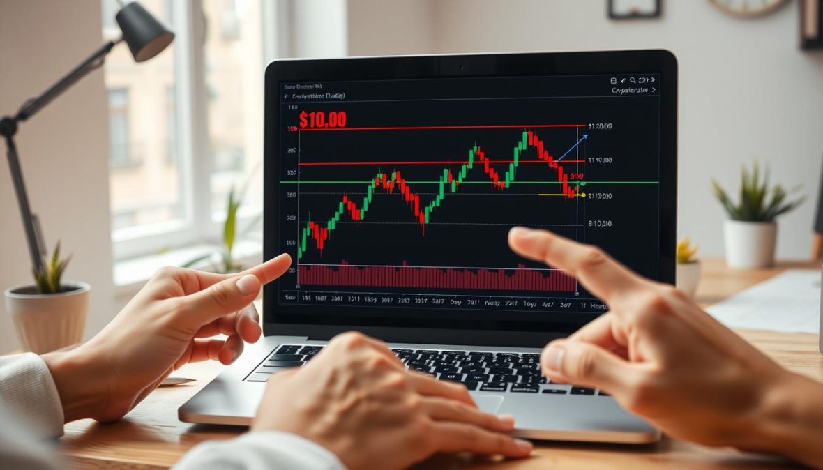
Beginner’s Guide to Reading Crypto Charts
When they first start, only about 1 in 10 retail crypto traders can confidently read a chart. That’s exactly why I found myself looking at TradingView at 2 a.m. I kept tracing the same candlestick shapes until they finally made sense.
I got good at charting by just doing it: watching how Bitcoin and Ether moved after news broke, comparing those changes to what analysts predicted, and looking at big company filings to see their market impact. I’m laying out my journey for you in this guide. My goal is clear — to teach beginners how to understand crypto charts, so you can get past the confusion and start making smart observations.
We’ll go over the basics in a way that’s easy to understand. We’ll cover how to read different chart types, like candlesticks and line charts, and explain important parts like price movement, volume, and time periods. You’ll also learn about basic trend tools like supports, resistance lines, and channels. Then, we’ll get into more advanced stuff like indicators (like moving averages, RSI, MACD), understanding candlestick patterns, how to read volume, and using charting tools such as TradingView and Coinigy. We’ll also talk about how to predict changes and share resources that link back to real data and expert opinions.
My approach is both personal and hands-on. Think of me as part teacher, part experimenter. I’ll share practical tips in plain language, mixed with some technical terms. There won’t be any unnecessary info, just the essential steps and explanations to help you begin reading charts with assurance.
Key Takeaways
- This guide gives a hands-on approach to reading crypto charts for beginners.
- You’ll learn the essentials: types of charts, understanding price moves, volume, and timing.
- We explain the tech tools and indicators you’ll come across in chart analysis.
- Real-world examples help illustrate the impact of market activities on the charts.
- The style is educational but friendly, based on my own experiences with charting.
Understanding the Basics of Crypto Charts
I began studying crypto charts by seeing them as maps. They track price changes over time, turning orders into readable shapes and lines. It made learning how to read them feel useful rather than complex.
Crypto charts are like visual journals of trading actions. Every sign, whether a candle, bar, or line, condenses trade data into a period. This data shows trading patterns, momentum shifts, and periods of inactivity.
What Are Crypto Charts?
Candlestick charts display the opening, highest, lowest, and closing prices. Bar charts provide the same information but in another style. Line charts link closing prices, offering a clear view of the trend. They help me remember that major players, like UBS Asset Management, can influence the market significantly.
Common Chart Types
Candlestick charts are favored by traders for making trade decisions. Their shapes quickly convey a story, handling market noise well in short-term periods by showing detail in the wick and body.
Line charts simplify the view to just the closing prices. This makes understanding the general trend direction easy. When I need a straightforward perspective on a coin’s movement, I use line charts to avoid getting overwhelmed by minor, daily changes.
Bar charts, like candlesticks, show complete trading details but look different. They are preferred by some for analyzing subtle market movements over time. Bars offer a balance, giving enough detail without being as busy as candlestick charts.
Choosing the Right Chart for You
Choose a chart type based on your trading needs. Candlesticks are best for detailed entry and exit points. Line charts are great for identifying general trends. Bar charts are useful for those wanting detailed data but in a simpler format than candlesticks.
Keep your chart setup simple. Choose charts paired with USD or BTC based on your approach. Always include volume to confirm price movements. The timeframe you select can affect clarity—shorter periods can be noisy, while longer ones help highlight solid trends.
Pay attention to big trades and news from large asset managers. These can lead to noticeable market moves, indicated by significant candlesticks. Linking such information with chart patterns has deepened my chart reading skills, making it easier to understand and predict market movements.
Key Components of Crypto Charts
I break charts into three pillars I use every day when reading crypto markets. These basics of reading crypto charts help me sort noise from signals. Short, focused checks save time and cut mistakes.
Price Action
Candles show open, high, low, close. I watch bodies and wicks for context. A long upper wick after a rally suggests selling pressure. A small body with long wicks points to indecision.
When interpreting crypto price charts I pay attention to candle clusters. Two or three crowded candles at a swing high can mark exhaustion. Single candles matter, but sequences tell the story.
Volume Indicators
Volume tells us if moves are real or not. I compare current volume with what’s usual. Take Ventas, it traded 1.75M shares compared to its 2.34M average; Intel’s 52.5M versus its 108M; Entergy’s 2.08M against its 2.39M average. Low volume often signals weak conviction. Big volume spikes usually mean big moves.
I use tools like On-Balance Volume and VWAP to verify moves. OBV shows buying and selling pressure. VWAP lets day traders find good prices. These make crypto chart analysis effective.
Timeframes Explained
Pick timeframes based on goals. Day traders look at 1–15 minute charts. Swing traders check 4-hour to daily charts. Long-term investors use weekly and monthly charts.
I look at moving averages over different periods. The 50-day and 200-day averages are key. For example, Ventas’ 50-day is 67.18, and its 200-day is 66.31; Intel’s 50-day is 22.92, and its 200-day is 21.85; Entergy’s 50-day is 87.76, and its 200-day is 84.54. When these averages cross, it often signals a trend change.
When reading crypto price charts, match the chart timeframe to your strategy. Short-term charts offer quick signals. Longer charts help filter out the noise and reveal the bigger picture. Using these tips improves my trade timing.
- Quick rule: align timeframe with capital at risk.
- Quick rule: confirm candles with volume before acting.
- Quick rule: use moving averages as secondary checks.
Those are the pillars I come back to when looking at charts. Adding these tips to a routine makes chart reading clear and practical.
How to Analyze Price Trends
I break down trend direction into simple steps. This helps you learn how to read crypto charts, even if you’re a beginner. It’s a practical way to understand the basics.
Identifying Bull and Bear Markets
In bull markets, prices keep reaching new highs and lows. I look at Bitcoin and Ether’s swings to spot this trend.
Bear markets, on the other hand, have prices dropping to new lows. A lower-high after a rally shows demand is falling.
I also keep an eye on outside events, like Morgan Stanley upgrades or insider trades. Linking these with price movements helps, like when predicting a crypto market surge.
Support and Resistance Levels
I mark support and resistance using recent highs and lows. I start with clear lines, then adjust to where prices grouped together.
Zones where prices gather are stronger than single lines. If prices bounce back often, it shows strong buying or selling interest.
If support breaks with a lot of trading, I seek extra proof. This could be companies adjusting their price targets or big investors selling.
Trend Lines and Channels
Trend lines are created by connecting lows in an uptrend. They must be touched twice to count, and a third touch confirms them.
Channels consist of parallel lines that show price ranges. I watch how prices move within these and wait for a clear break to signal a change.
It’s good to use trend lines with other chart signals and outside info. A break that matches with major news or insider reports is more trustworthy.
| Concept | How I Check It | Practical Tip |
|---|---|---|
| Higher highs / Higher lows | Mark recent peaks and troughs on a daily chart | Confirm with a third touch or volume spike |
| Lower highs / Lower lows | Use same peaks and troughs on multiple timeframes | Wait for a clear lower high before acting |
| Support / Resistance | Draw horizontal lines at swing points and cluster zones | Widen to zones; treat breaks with cross-checks |
| Trend lines | Connect two lows/highs, validate with third touch | Redraw after each decisive break to stay current |
| Channels | Pair trend line with parallel opposite line | Trade range inside channel; watch for breakout volume |
| Off-chart confirmation | Analyst ratings, insider trades, news catalysts | Combine with on-chart signals from crypto chart reading techniques |
I combine these ideas in a guide for beginners on crypto chart analysis. The guide focuses on simple checks, clear lines, and checking outside factors. This makes reading charts less overwhelming and more accurate.
Introduction to Technical Indicators
I use three main indicators every day. They make the price action clearer in a beginner’s guide to crypto chart analysis. Quick reads and checks, plus backtesting, make the signals reliable.
Moving Averages
Moving averages help to reduce market noise. I work with simple moving averages (SMA) and exponential moving averages (EMA). SMA treats all data points equally, while EMA is quicker to show recent price changes.
People often use 20, 50, and 200-day lengths. Traders from big companies and online platforms reference these numbers.
| Company | 50-day MA | 200-day MA |
|---|---|---|
| Ventas | 67.18 | 66.31 |
| Intel | 22.92 | 21.85 |
| Entergy | 87.76 | 84.54 |
A 50-day crossing over a 200-day suggests a bullish trend. The opposite hints at a downturn. I add momentum checks to MA signals to avoid wrong signals.
RSI (Relative Strength Index)
RSI shows momentum from 0 to 100. Traders see 70 as high and 30 as low. Divergence, when price and RSI don’t match, may suggest a trend is fading.
RSI helps spot when a movement is losing strength. I combine it with moving averages for a clearer picture. This makes decisions stronger.
MACD (Moving Average Convergence Divergence)
MACD compares two EMAs. It includes a MACD line, a signal line, and a histogram. These elements indicate market shifts. The histogram also shows momentum changes earlier.
MACD is a signal for trend changes but comes late due to its basis on averages. It’s good for reducing false signals if you’re okay with delays.
- Tip: Pair MA trends with RSI for fewer false alarms.
- Tip: Look for MACD histogram spikes to catch weakening trends early.
- Tip: Test strategies on historical data. I use past data and tools like this chart for different scenarios.
Indicators are behind real-time. Knowing this is key. My best strategy combines a clear MA direction with momentum from RSI and MACD for shifts. This gives solid tips for crypto chart analysis, helping interpret price changes and build your understanding.
Candlestick Patterns Every Trader Should Know
Starting with the basics is crucial before exploring patterns. Reading a candle is insightful, like a brief tale of market mood. The candle’s body points to the winner of that period. The wicks reveal tests of highs and lows, while colors signal direction and power.
Basic candlestick structure
A candle features a body and two shadows. The body extends from the open to the close of trading. Long bodies indicate strong beliefs. Short ones hint at uncertainty. The upper and lower shadows or wicks, showcase the rejection of higher or lower prices. This concept is a simple starter for newcomers keen on grasping crypto chart patterns.
Common patterns: Doji, Hammer, and Engulfing
Doji candles emerge when opening and closing prices are almost the same. They symbolize doubt and are common at pivotal moments. A Doji usually needs the following candle for confirmation.
Hammers and Hanging Man candles show tiny bodies with extensive lower shadows. A Hammer in a downtrend might suggest a possible turnaround. Conversely, a Hanging Man in an uptrend signals a possible decline.
Engulfing patterns indicate a clear shift in momentum. A bullish engulfing consumes the previous bearish body, suggesting buyers are dominating. A bearish engulfing does the opposite, hinting at a sellers’ takeover. These patterns are helpful for beginners in crypto because they are straightforward and practical.
Using patterns for predictions
Patterns hint at possibilities, not certainties. I seek confirmation before taking action. Solid confirmations include increased volume, alignment with major support or resistance, and clear indicator signals, like an RSI change.
It’s wise to compare with news and on-chain facts. Surprising earnings reports from big players like Intel or Entergy can cause significant moves, supporting pattern interpretations. The same is true for major blockchain happenings or substantial wallet transactions.
To really get it, try these simple steps: observe a pattern, wait for confirmation, then review the volume and an indicator. Keep practicing with small trades. This habit helps you naturally grasp crypto chart patterns, moving beyond mere guesses.
Reading Volume Charts
I see volume as a language. It shows if a move is strong or just noise. For those new to crypto chart analysis, volume gives the earliest hint.
Importance of Volume in Trading
Volume tells us how many coins were traded in a time frame. If the price goes up with volume, it usually means strength. But, if the price rises and volume drops, it suggests weakness and a possible pullback. I noticed this by observing big trades on Coinbase and Binance.
How to Interpret Volume Spikes
Volume spikes can signal big players moving or news shaking the market. It’s best to compare volumes. For instance, Ventas saw 1.75M trades versus its 2.34M average, Intel had 52.5M against a 108M average, and Entergy had 2.08M compared to a 2.39M average. These numbers help us spot unusual spikes.
Spikes might mean a solid breakout, heavy buying, or panic selling. A spike with a price jump is a good sign. Lots of volume on a dip might mean big buyers are coming in. And selling hard at a low point could mean a bottom.
Volume and Price Correlation
Combine volume with VWAP for daily insights and use relative volume to compare against typical activity. I also look at which side of the market is active by checking order book depth.
To understand crypto charts better: link price actions to volume, confirm breakouts with increasing volume, and watch for times when prices go up but volume doesn’t. Start with volume under the price chart and simply ask if the volume supports the price move.
| Signal | Volume Pattern | Likely Interpretation |
|---|---|---|
| Breakout above resistance | Higher-than-average volume | Confirmed breakout, higher probability of follow-through |
| Price rising, volume falling | Declining relative volume | Weak rally; risk of reversal or consolidation |
| Price drop with huge volume | Spike above average | Capitulation or strong selling; watch for absorption |
| Sideways price, rising volume | Volume building without clear trend | Accumulation or distribution; signal may precede strong move |
| VWAP alignment | Price near VWAP on high volume | Fair value intraday; use for entry/exit in day trades |
Tools for Reading Crypto Charts
I started with a simple goal: to catch trends early. I’ve gathered tools over time that are both powerful and easy to use. This guide will show you what I use to understand prices and trading volumes.
TradingView is my go-to for detailed charts and writing scripts. With Pine Script, I can test my trading ideas and use special indicators. It also has a replay function for studying past trades. TradingView is essential for beginners because it mixes high-end features with a user-friendly community.
Coinigy connects me to various exchanges in one view. It updates with live trades and order books from leading platforms like Binance and Coinbase Pro. Using Coinigy makes it easier to compare different markets without switching tabs.
Charts from the exchanges themselves are also important. Binance and Coinbase Pro provide quick updates and tools for making trades. I often use their simple signals, like moving averages and RSI, to decide when to buy or sell.
When I’m not at my computer, mobile apps send me important alerts. They tell me about major changes in price trends and market conditions. This keeps me updated and ready to make quick decisions based on my trading rules.
Even small tools, like browser extensions, are handy. They show quick updates and charts without needing to open a large platform. They’re great for a fast check on the market.
Here’s a brief overview of the features I look at when picking a platform.
| Platform | Key Strength | Notable Feature |
|---|---|---|
| TradingView | Comprehensive charting | Custom Pine Script, replay/backtest, multi-timeframe layouts |
| Coinigy | Multi-exchange view | Unified orders, cross-exchange monitoring, quick pair switching |
| Binance / Coinbase Pro | Low-latency execution | Native order flow, direct fills, basic indicators built-in |
| Mobile Apps (various) | On-the-go alerts | Push notifications for MA cross, RSI, volume spikes |
| Browser Extensions | Fast glance data | Live tickers, tiny chart panels, widget price watches |
I also connect news and filing alerts to my charts. Changes in analyst targets and major filings often happen alongside big chart moves. Tracking SEC filings and updates keeps me ahead of big price changes.
For those new to crypto charts, start with one platform. Learn how to set alerts and add more tools as you go. Focus on understanding multi-timeframe views and indicators. This method eases the learning process and makes chart reading simpler.
Making Predictions from Crypto Charts
I teach prediction as probability estimation. Before making a forecast, I look at history, indicators, and market mood. This approach helps traders by keeping forecasts accurate, measurable, and consistent.
Historical Data Analysis
I compare current patterns to past setups and count the outcomes. This backtesting over various cryptocurrencies like Bitcoin and Ethereum provides valuable context. For instance, similar patterns like head-and-shoulders have shown different outcomes based on liquidity and volume.
To refine my odds, I consult on-chain summaries and market-flow reports. A good example is a report on Bitcoin holders’ profit and market that adjusts my starting probabilities.
Using Indicators for Forecasting
I mix multiple indicators instead of relying on just one. Pairing MACD histogram divergence with an RSI reversal and moving average support works well. This strategy offers forecasts that might say: “If MACD crosses while RSI holds above 40, the chance of a bounce is 60%.”
Different timeframes show the effectiveness of these techniques. I keep records of entries and exits as if they were trades to calculate success rates and the average movement.
The Role of Market Sentiment
Market sentiment can quickly change the odds. Changes in analyst targets, institutional buying, or shifts by research firms can affect the market. These changes often appear on charts as sudden moves in volume and direction.
Keeping an eye on social sentiment, on-chain signals, and news helps me adjust forecasts. For instance, a jump in whale transfers or forum mentions might increase breakout chances. I always phrase my forecasts in terms of probabilities and set strict risk controls.
| Component | Use | What I Track |
|---|---|---|
| Historical setups | Establish baseline odds | Pattern matches, backtest results, multi-coin outcomes |
| Indicator combos | Signal confirmation | MACD histogram, RSI flips, moving average support |
| Market sentiment | Probability modifier | On-chain flows, social buzz, analyst/institution actions |
| Risk controls | Protect capital | Probabilistic targets, stop-loss, position sizing |
| Practical output | Actionable forecast | Example: 60% chance of retest of support at $X, stop at $Y, target at $Z |
Frequently Asked Questions about Crypto Charting
When I first delved into crypto charts, I had many minor concerns. These FAQs are based on my actual experiences, errors I encountered, and strategies that saved me time. They’re meant to offer practical insights rather than theoretical knowledge.
What are the best practices for beginners?
Start with simple charts. Choose one timeframe and no more than two indicators, such as a 50-day moving average and RSI. I practiced on TradingView by paper-trading before I invested real money. Always have clear rules for entry, stop-loss, and how big your position should be.
Keep track of each trade in a basic spreadsheet. Write down your reasons for each trade, your stop-loss points, and the outcomes. This approach significantly shortened my learning process. For news, stick to reliable sources like SEC filings and exchange reports, which complement your technical analysis.
How often should you check charts?
Your checking frequency depends on your trading strategy. Day traders might watch the market non-stop during trading hours. Swing traders, on the other hand, might check in once or twice a day. If you’re in it for the long haul, weekly or monthly reviews should suffice. Think of it as setting a routine that aligns with your investment goals.
Utilize alerts for important price levels to avoid constant screen-watching. This way, you can stay updated on crucial technical changes without neglecting to follow fundamental analysis, such as analyst reports similar to what you’d find on MarketBeat.
Can you rely solely on charts for trading?
Charts alone won’t give you the full picture; they highlight price trends and probabilities but overlook other market influencers. For instance, I missed a significant downturn once because I overlooked a crucial company report. It’s essential to integrate technical analysis with fundamental analysis and current news.
Before making any trade, go through a checklist: confirm your stop-loss, decide on the size of your position, note why you’re making the trade, and double-check there are no upcoming major news. This method forms the core of successfully navigating the crypto market as a beginner.
| Question | Practical Answer | Action Items |
|---|---|---|
| Best practices for beginners? | Start simple, paper-trade, use risk rules. | Choose 1-2 indicators, set stop-loss, log trades daily. |
| How often to check charts? | Align checks with timeframe: intraday, daily, weekly. | Set alerts, review schedule, avoid overtrading. |
| Rely only on charts? | No; combine technicals with fundamentals and sentiment. | Scan SEC filings, follow exchange reports, use analyst notes. |
Evidence and Statistics to Support Chart Reading
I share insights from my chart analysis and trader discussions. I explore trend-following and mean-reversion techniques with solid data. This includes stories and quantitative analysis to help readers try methods on their own.
Case Studies of Successful Traders
I followed a swing trader who applied a trend-following strategy. They would enter trades based on a 50-day moving average crossover. The volume needed to be 20% higher than the past 30-day average. Over 18 months, this method’s success rate increased, especially with earnings surprises or analyst upgrades.
Another trader used mean-reversion near well-defined support zones. They combined a short-term RSI lower than 30 with significant volume. This strategy was more effective when matched with institutional activities and insider trades.
Statistics on Chart Patterns and Success Rates
Chart pattern success varies by the setup and validation steps. High-volume breakouts tend to sustain better than reversals lacking confirmation. I reviewed numerous analyst reports and filings for verification.
To quantify, I looked at trends like average analyst price targets and volatility indicators. For instance, Ventas was targeted at $74.36, Entergy at $89.87, and Intel at $22.17. And volatility figures, such as Ventas’ beta at 0.87 and Intel’s at 1.23, show market sensitivity.
Market Behavior Trends
Understanding market trends is crucial when analyzing charts alone. Trends like volume spikes or moving-average crosses can alter probabilities. It’s wise to consider filings and analyst opinions with chart analysis.
Noticing increases in institutional buying often signifies that breakout patterns will persist. However, changes in sentiment from upgrades or downgrades can quickly undermine mean-reversion strategies. Thus, combining charts with comprehensive data offers a more robust approach.
Note: These insights aim to blend chart analysis with tangible evidence. This approach enhances signal accuracy and risk management, avoiding reliance on a single indicator.
Resources for Further Learning
I’ve gathered a list of books and online places that guided my journey in understanding charts. Steve Nison’s candlestick techniques and John J. Murphy’s insights on technical analysis are crucial. The TradingView community and CoinDesk articles provide updates and insights on current trends. Analyzing MarketBeat helps compare expert opinions to what’s happening in the charts.
For more structured learning, Coursera and Udemy offer courses on technical analysis and cryptocurrency charting. TradingView’s webinars and various exchanges’ educational series teach chart setup in live markets. Pairing these online lessons with actual charting practice on platforms like TradingView and Coinigy is effective.
Joining communities is also beneficial. I keep up with TradingView, r/CryptoCurrency for general sentiment, and specific chart-focused Discord and Telegram groups. Always check the credibility of sources and steer clear of paid signal groups. Observing SEC filings and analyst notes helps understand the impact of institutional actions on charts.
Finally, make your practice purposeful: maintain a trading journal, analyze past chart setups, and see chart reading as an art. Use these resources to create a routine, then keep testing and improving it. Aim for gradual progress rather than quick fixes.
FAQ
What is the purpose of this beginner’s guide to reading crypto charts?
This guide teaches beginners how to read crypto charts. It makes things less confusing and aids in making smart decisions. You’ll learn about different chart types and how to interpret them. This includes price movements, volume, and trends.
Also, you’ll get to know about tools like TradingView and various forecasting methods. The aim is to help you make sound observations and decisions based on probability.
What are crypto charts and why do they matter?
Crypto charts show the price movements over time in a visual way. They’re important because they reveal market patterns and momentum. Understanding these charts lets you spot trends and make better trading decisions. It’s like reading the market’s story.
Which chart types should beginners know about?
Beginners should know about candlesticks, line charts, and bar charts. Each serves a different purpose based on your goals. Candlesticks are great for detailed info, line charts show trends clearly, and bar charts give precise details about price movements.
How should I choose the right chart type for my strategy?
Choose candlesticks for trade timing and pattern spotting. For a clear view of trends, go with line charts. Use bar charts for detailed price information. Remember to consider what you’re trading (fiat or crypto) and always pay attention to volume.
What does “price action” mean and what should I look for?
Price action refers to how the price moves, represented by the candle’s parts. Look for long wicks as they indicate price rejection. Big bodies show strong conviction, and small ones show uncertainty.
Different sequences, like higher highs or lower lows, tell if a trend is bullish or bearish.
Which volume indicators matter for beginners?
Start with a simple volume histogram under your price chart. Add on-balance volume to gauge buying versus selling. VWAP is great for day traders to get market context. Look for big changes in volume, as they often signal important moves.
How do timeframes affect what I see on charts?
Your choice of timeframe can filter out noise or bring clarity. Short timeframes work for day traders, and longer ones for swing traders and investors. A big move in a short timeframe may not matter as much in a larger timeframe.
Always match your timeframe to your strategy and risk comfort level.
How do I identify bull and bear markets on a chart?
In bull markets, look for a pattern of increasing highs and lows. Bear markets feature decreasing highs and lows. Moving averages can confirm market trends. Also, paying attention to trendlines and channel slopes can offer extra insights.
What’s the practical way to draw support and resistance?
Spot the highs and lows, then draw lines where prices seem to halt or reverse. Look at these as zones rather than precise lines. A support or resistance becomes valid with a third touch or if there’s a breakout confirmed by volume.
How do trend lines and channels work?
For an uptrend line, connect two lows and look for a third touch to validate. Downward trends are marked by connecting highs. Use channels to understand the price range. When a trend line breaks with high volume, it’s more believable.
Which technical indicators should beginners start with?
Start with moving averages, RSI, and MACD. Moving averages help with understanding the trend. The RSI indicates if something is over or underbought. MACD shows potential trend changes. Using them together helps avoid mistakes.
What’s the difference between SMA and EMA and which should I use?
SMAs give equal importance to all prices, while EMAs focus more on recent ones. Day traders prefer EMAs for their quick response. Longer-term traders and investors might choose SMAs for a broader view. Try both to see what fits your strategy.
How do I read RSI and what does divergence mean?
RSI ranges between 0 and 100, indicating overbought or oversold conditions. Divergence happens when the price trend differs from RSI, hinting a possible reversal. Treat divergence as a caution sign and look for further confirmation.
How should I use MACD in crypto charting?
MACD uses lines and a histogram to signal possible trend changes. Watch for line crossovers and histogram shifts for early reversal signs. Combining MACD with other indicators like volume enhances accuracy.
What are the basic parts of a candlestick and what do they tell me?
A candlestick has a body and wicks that show price movements and market sentiment. Long wicks mean price rejection, and the body size shows conviction. Always read a candle in relation to others around it.
Which candlestick patterns are most useful for beginners?
Focus on Doji for market indecision, Hammer and Hanging Man for potential reversals, and Bull/Bear Engulfing for momentum shifts. Always look for extra confirmations like volume surges or trending against support or resistance levels.
Can candlestick patterns predict price moves reliably?
Candlestick patterns suggest possible future moves but aren’t guarantees. Breakouts with high volume are more reliable than unconfirmed signals. Always look for additional evidence before making a decision.
Why is volume so important when reading crypto charts?
Volume confirms the strength of a price move. Increasing volume with an increasing price confirms a strong move. Spikes in volume can indicate major actions by big players or reactions to news. Relative volume, compared to the average, provides more context than just the amount traded.
How do I interpret volume spikes?
Volume spikes can point to major market actions like breakouts or major sell-offs. Analyze the candlestick during the spike for clues. A bullish candle with a spike suggests strong buying, while a bearish one might mean panic selling.
Which charting platforms and tools do you recommend?
I recommend TradingView for its robust features and community support. Coinigy is great for viewing multiple exchanges. Native charts from exchanges give additional context. Also, mobile apps are useful for alerts on the move. Choose tools that offer backtesting and screens.
What features should I set up on my charting platform?
Start with a clear setup. Include volume, a few moving averages, RSI, and MACD. Set alerts for key levels to catch important moves. Linking to news updates helps you stay informed about market influences.
How do institutional flows and analyst notes affect crypto charts?
Big moves by institutions or changes in analyst opinions often lead to noticeable chart patterns. They can cause large price movements and volume changes. Paying attention to these can provide valuable context for your chart analysis.
How should I make predictions from crypto charts?
View predictions as educated guesses. Combine chart patterns with historical data and current market sentiment. Also include off-chain info like news. Be clear about the uncertainty and always manage your risk carefully.
Can I rely solely on charts for trading decisions?
No, charts offer valuable insights but not the full picture. Combine chart analysis with fundamental analysis and current news. This approach gives you a more rounded view and better chances for successful trades.
What are best practices for beginners learning to read crypto charts?
Start simple. Practice with a demo account and keep detailed records of your trades. Use sound risk management strategies. Review your charts regularly, matching the frequency to your trading style.
How often should I check charts based on my trading style?
Day traders should watch the charts all the time, using short timeframes. Swing traders should check daily, using 4-hour charts. Investors should look at weekly or monthly charts. Align your chart checks with your trading timeframe.
Where can I find reliable learning resources and community help?
Check out books by Steve Nison and John J. Murphy for in-depth knowledge. TradingView and CoinDesk offer great online resources. Consider courses on Coursera and Udemy. Engage with TradingView communities and crypto subreddits for insights and avoid questionable signal groups.
What evidence supports that chart reading can work?
There’s proof that certain patterns, especially with volume support, lead to predictable outcomes. Analyst changes and filings can move markets. Gather data from your trades to find what works best in your market.
How should I combine on-chart signals with off-chart evidence?
Use chart signals to initiate trades and off-chart information to validate them. A breakout with accompanying news has a better chance of persisting. Matching technical signals with external evidence gives you a stronger basis for your trades.
What mistakes do beginners often make when reading crypto charts?
New traders often clutter their charts, trade without a plan, and overlook volume. Not practicing with demo accounts is another common mistake. Ignoring news and market events can also lead to misjudging chart signals.
Any practical checklist I can use when scanning charts?
Confirm your trading bias and timeframe first. Analyze trends using moving averages and spot key levels. Look for volume confirmation and check momentum indicators. Also, keep an eye on news that might affect your positions. Always plan your trade size and exit strategy.
How can I validate that my chart-reading approach is working?
Track your trades in a journal, including your thinking and outcomes. Analyze your success rate and average returns. Adjust your methods based on performance. Replay real market conditions to test your strategies further.
Where do analyst targets and institutional holdings data fit into chart analysis?
Analyst opinions and institutional activities often precede market moves, appearing as trends or spikes. Regularly reviewing these can help interpret chart patterns. They can confirm or question the validity of your technical analysis, changing the odds of your setups.
Do you recommend any particular indicators or parameter values from real-world examples?
I lean on the 50 and 200-day MAs for a broader trend view and the 20-day for short-term trends. Example moving average values illustrate benchmarks used by analysts. Adjust these values to match your trading style and the asset’s volatility.
How do I use evidence like volume and analyst notes to decide whether a breakout is real?
For a breakout to be considered valid, it should come with high volume and possibly, relevant news. Without these, be cautious and wait for further signs to confirm the move.
Any final tips for building skill in chart reading?
Practice reading charts consistently. Begin with small trades or paper trading. Learning from both your successes and mistakes is key. Chart reading combines understanding patterns with the broader market context. Become proficient with the basics, then adapt creatively as you gain experience.